一般我们可以使用背景图的方式给图片添加阴影,但对于不固定尺寸的图片如何实现呢?
我们可以采取“视觉欺骗大法”——定义渐变边框来实现
代码:
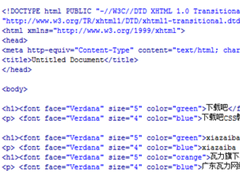
<!DOCTYPE html PUBLIC "-//W3C//DTD XHTML 1.0 Transitional//EN" "http://www.w3.org/TR/xhtml1/DTD/xhtml1-transitional.dtd">
<html xmlns="http://www.w3.org/1999/xhtml">
<head>
<meta http-equiv="Content-Type" content="text/html; charset=utf-8" />
<meta http-equiv="Content-Language" content="zh-CN" />
<title></title>
<style type="text/css" >
body {background:#2e334d;}
img {border:none;}
a.pic-shadow {display:inline-block;zoom:1;padding:1px;background:#262a3f;border:solid #2b3048 1px;border-radius:5px;-moz-border-radius:5px;-webkit-border-radius:5px;}
a.pic-shadow img {padding:1px;background:#13151f;border:solid #1e2132 1px;border-radius:5px;-moz-border-radius:5px;-webkit-border-radius:5px;}
</style>
</head>
<body>
<a class="pic-shadow" href="#" title=""><img src=http://www.shancun.net/skin/default/image/nopic.gif alt="" title="" /></a>
</body>
</html>
border-radius:5px;
-moz-border-radius:5px;
-webkit-border-radius:5px;
上面这段定义是各标准浏览器中圆角定义,用以更专业地欺骗眼睛
颜色代码可以在ps中做好外发光效果后拾取。
我上面的效果是[柔和]、[扩展0]、[大小5px]、[颜色#000]其余默认
当然了,特殊要求的话可以使用ie的滤镜来实现更华丽的阴影.