如果你是一名前端开发工程师,一般px和em使用频率比较高。但是今天本文的重点是介绍一些我们使用很少、甚至么有听说的单位。
一、重温em
<style type="text/css">
body {font-size: 12px;}
div {font-size: 1.5em;}
</style>
<body>
<div>
Test-01 (12px * 1.5 = 18px)
<div>
Test-02 (18px * 1.5 = 27px)
<div>
Test-03 (27px * 1.5 = 41px)
</div>
</div>
</div>
</body>
因为font-size具有继承性,所以层数越深字体越大。
二、rem
虽然上面使用em的情况可能会在开发中用到,但是我们有时候想有一个基准来扩展。遇到这种需求时,我们可以使用rem单位,rem中的“r”代表“root”,这意味着设置当前元素的字体大小为根元素,大多数情况下,我们会设置在html元素上。
<style type="text/css">
html {font-size: 12px;}
div {font-size: 1.5rem;}
</style>
<body>
<div>
Test-01 (12px * 1.5 = 18px)
<div>
Test-02 (12px * 1.5 = 18px)
<div>
Test-03 (12px * 1.5 = 18px)
</div>
</div>
</div>
</body>
当然,rem单位不仅应用在字体上,还可以实现到CSS 网格系统中。
三、vh 和 vw
在进行响应式布局时,我们常常会使用百分比来布局,然而CSS的百分比不总是解决每个问题的最佳方案,CSS的宽度相对于离它最近的父元素的宽度。 如果你想使用视口的宽度、高度而不是父元素的宽高,可以使用vh和vw单位。 1vh = viewportHeight * 1/100; 1vw = viewportWidth * 1/100; 使用vh、vw就可以保证元素的宽高适应不同设备。
四、vmin 和 vmax
vw和vh对应于viewport的width和height,而vmin和vmax分别对应于width、height中的最小值和最大值,例如如果浏览器的宽/高被设置为1000px/600px,那么
1vmin = 600 * 1/100;
1vmax = 1000 * 1/100;
<style type="text/css">
.box {
height: 100vmin;
width : 100vmin;
}
</style>
<body>
<div class="box" style="background-color: #f00">
fdasjfdlas
</div>
</body>
<style type="text/css">
body {
margin: 0;
padding:0;
}
.box {
height: 100vmin;
width : 100vmax;
}
</style>
<div class="box" style="background-color: #f00">
fdasjfdlas
</div>
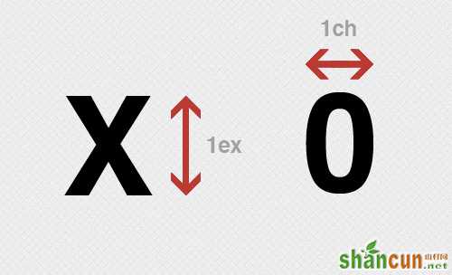
五、ex 和 ch
ex、ch单位与em、rem相似之处在于都依赖于font-size,但是ex、ch还依赖于font-family,基于font-specific来计算。 引用w3C规范:
ex unit Equal to the used x-height of the first available font. [CSS3-FONTS] The x-height is so called because it is often equal to the height of the lowercase "x". However, an ‘ex’ is defined even for fonts that do not contain an "x". The x-height of a font can be found in different ways. Some fonts contain reliable metrics for the x-height. If reliable font metrics are not available, UAs may determine the x-height from the height of a lowercase glyph. One possible heuristic is to look at how far the glyph for the lowercase "o" extends below the baseline, and subtract that value from the top of its bounding box. In the cases where it is impossible or impractical to determine the x-height, a value of 0.5em must be assumed.
ch unit Equal to the used advance measure of the "0" (ZERO, U+0030) glyph found in the font used to render it.
用一副图来解释这两种单位的含义:
这两种单位,有许多用途,大部分是用于印刷时的微调整。例如,sup、sub元素分别显示上标和下标,但是我们可以使用position和bottom模拟:
<style type="text/css">
body {
margin: 0;
padding:0;
}
.sup {
position: relative;
bottom: 1ex;
}
.sub {
position: relative;
bottom: -1ex;
}
</style>
<div>
AaB<span class="sup">b</span>CcXxD<span class="sub">d</span>EeFf
</div>